
I’m going to break this down into story and art, then give a final overall rating.
Story:
Let’s look at the plot:
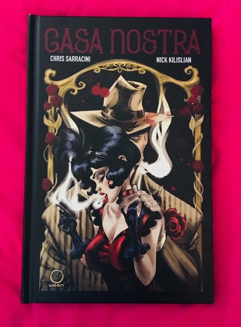
In 1933 Chicago, four women run a comforting safe house for Chicago criminals looking to lay low. But when the ladies find themselves violently betrayed by one of their distinguised guests, revenge becomes their new business. Daring heists, dirty money, infamous gangsters and Tommy guns are all a part of the plan in this original noir graphic novel.
The story was simple in a good way and I really enjoyed it. I loved how there are no good guys, only bad guys and those that help bad guys.
It did get confusing for me for a moment around page 20 (there were no page numbers in the book) and it just skipped to another scene abruptly. It does that a couple more times in the book which is my only complaint story-wise. Those moments were jarring and it took me a second to figure out, ‘oh this is a different part of the same story. This is a different scene’
I’m not going to give you context and I’ll try not to spoil much but here’s an idea of what I mean.
On one page a person is in a bed recovering from her injuries and on the next page you see yourself outside of a jewelry store. Yes, there is white text indicating a different location, but it still didn’t seem to work for me.
This kind of thing happened a couple of times.
I get why it was done, but it just felt off for me at times when things like that happened in the story.
Overall I enjoyed the story and would give for the story alone 3 stars. Not groundbreaking, but enjoyable.
Illustration:
The art… oh god the art. I’m flipping through the book right now just so I can look at it. It’s beautiful. If you want to see more of the work here’s the site.*
I love the style of drawing, so much so I hope Kilislian will do more graphic novels in this style in the future. The coloring really set the mood for this noir story. Sticking with shades of grey, browns, and mustard with the occasional pops of color here and there depending on the scene whether they are shades of blue or blood red.
Now there were scenes of violence and I thought how the artist handled it well when it came to depicting it. It got the point across without the violence being heavy handed and in your face overall.
Back to the art in general. I really hope the artist does more of his own original work in the future, and I really hope it’s in this style or something similar.
I have to give the artwork 5 stars.
Overall
If I combined both the story and the artwork, it would be 4 stars. It’s mostly the story that’s holding it back, thankfully the art makes up for it. I believe it is worth getting if you don’t mind a little violence and grit in your story and art.
*I am not responsible for this other site and they have their own rules and policies.
